Dashboard overview
In this release the previous HOME page has been replaced by the brand new “dashboard overview”. The idea for the dashboard is to give the scheduler indications of bottlenecks for a certain scheduling period. In other words, to answer questions like where should I start scheduling? Where is the peak? Or, based on number of planned students or number of rooms booked, when do I need more supervisors? Etc.
The dashboard will be the first page when entering TE Exam and can later be found under the “Ex” icon in the top left corner.

Select chart series
The default value for the dashboard is set to show exam requests and scheduled exams one month ahead of today’s date. To select other chart series, start by unchecking the default values in the “selected series” dropdown.

In order to combine chart series with different scales, eg. planned students and needed supervisors, secondary chart series can be selected in the second dropdown. The chart series selected for the secondary axis will be indicated by a dashed line.

Use the tooltip
In order to more easily read the exact chart values in the dashboard you can use the tooltip, it will appear when hovering over the dashboard.

Zoom in a certain period
When selecting a long date range in the date picker, it might be too much information in one view. Then the bottom “slider” can be used in order so zoom in for a shorter period and then swipe the slider to the left and right side. Zoom in by clicking in the left or right corner of the slider and drag it towards the middle.

Improvements
Indication for expired bookings
When a supervisor booking has expired, the supervisor will be made available again since he or she didn’t decline nor accept the booking. This means that the same supervisor could be asked a second time for the same date and time. In order to avoid asking twice, a new column has been added to the booking pane in the available tab for “Expired booking request”.

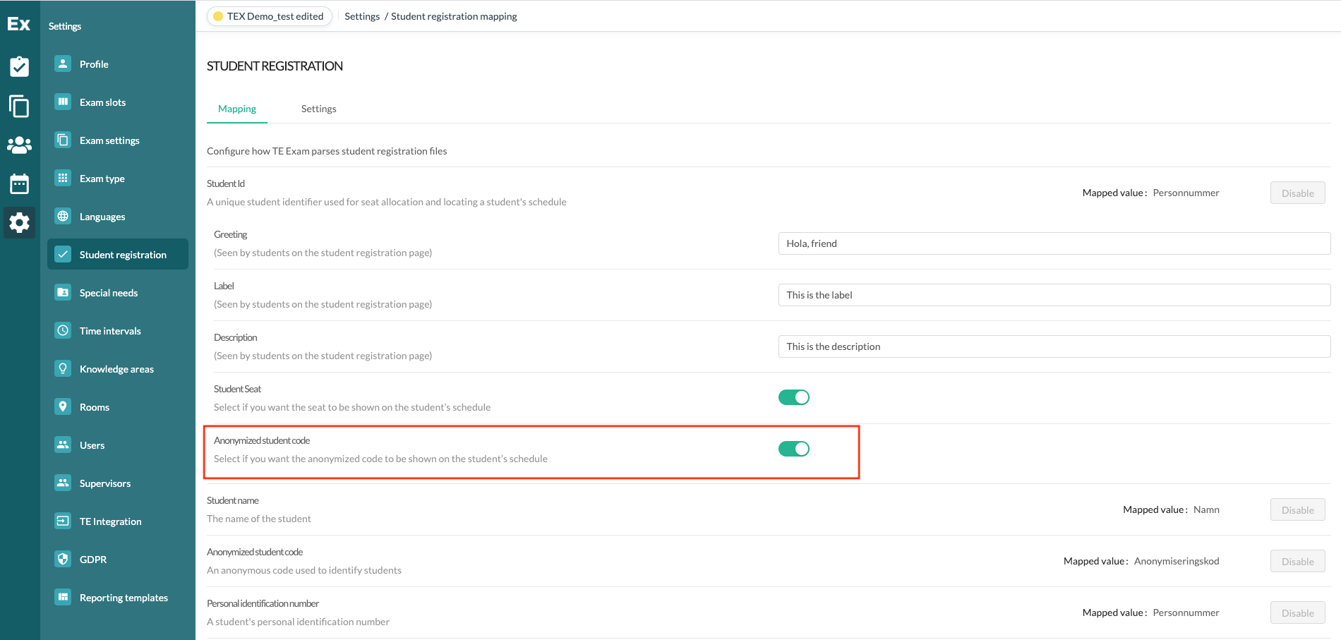
Anonymized student code on student page
There is a setting added to the student registration page where the anonymized student code can be rendered on the student page. If enabled, the student anonymized code will be shown on the student page in the top left.

Cancelled exams can’t be edited
Once an exam has been cancelled, it can no longer be edited by an exam manager. The exam can still be duplicated by the exam manager and edited by an exam administrator.
Bug fixes,
Resolved a bug where the “last updated” date stamp didn’t update when the booking status changed to “expired”.
Resolved a bug where the organization groups weren’t sorted and therefore hard to find when adding a new user.
Resolved a bug where the primary language wasn’t set as default when adding a new user.


